Move It and Lose It Cumulative Poster Campaign, by Erica...
Read Morepresentation graphics (pdf)
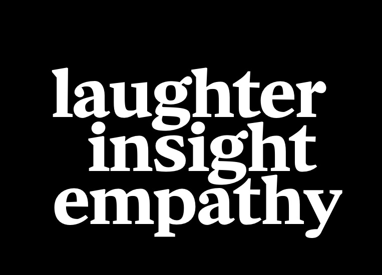
I hate wishy-washy PowerPoints! For my talk at the Electronic Literature Organization conference at the University of West Virginia in June of 2012 I used Cyrus Highsmith’s powerful font Zocalo in massive sizes against a black background. Wittig Netprov Talk 2012 pdf
Read Moretwo-tragedy-mask Logo
My personal mark, the two tragedy masks. I use this in the manner of an asian “chop” signature for visual/verbal work.
Read MoreUMR recruiting poster
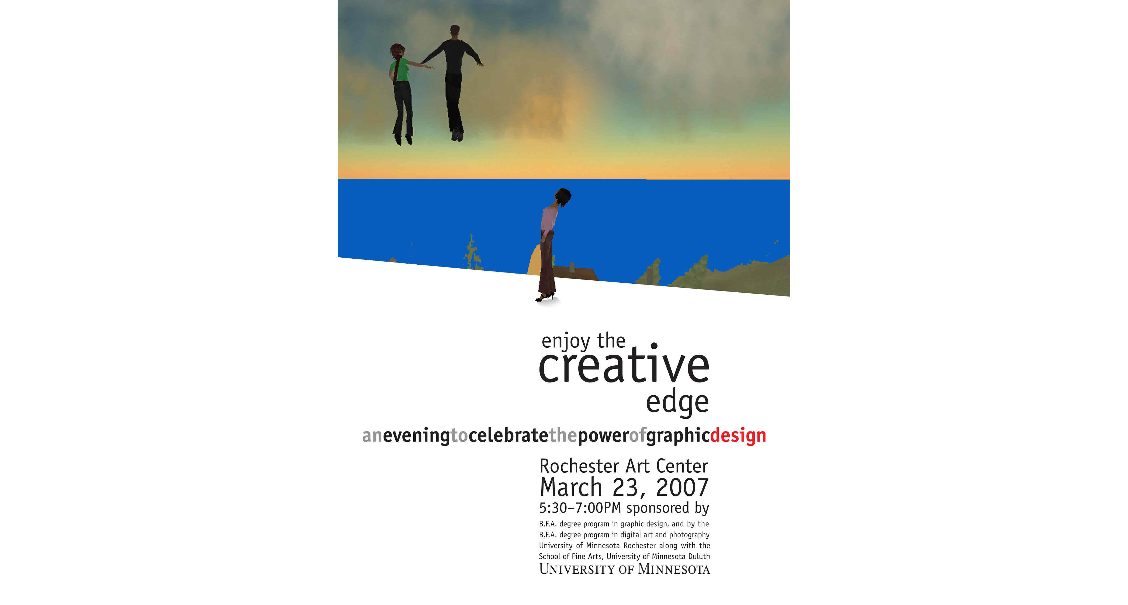
Poster for a recruiting event for the UMD-administered University of Minnesota Rochester Graphic Design program. view larger version
Read Morescrolling photo-emoticons
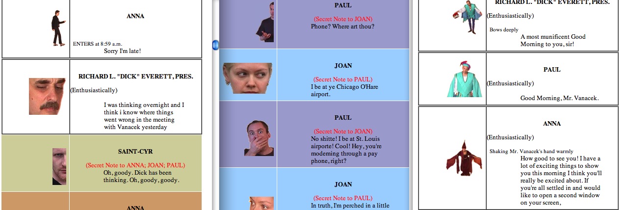
Friday’s Big Meeting is a web comedy that takes place in the fictional in-house chat room of a small design firm. In my search for readable web-based literary typography I was intrigued by the efficiency and openness of the written format of Hollywood scripts. I noted that scripts include terse, third-person descriptions of characters actions — the...
Read More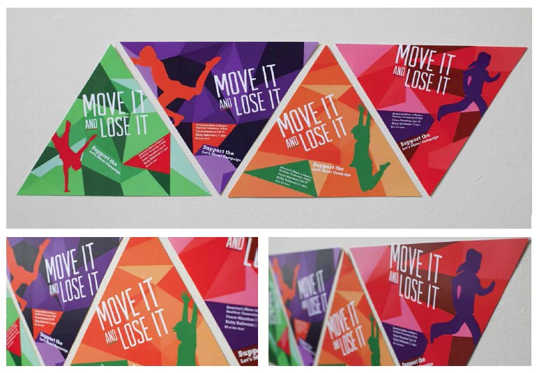

Recent Comments